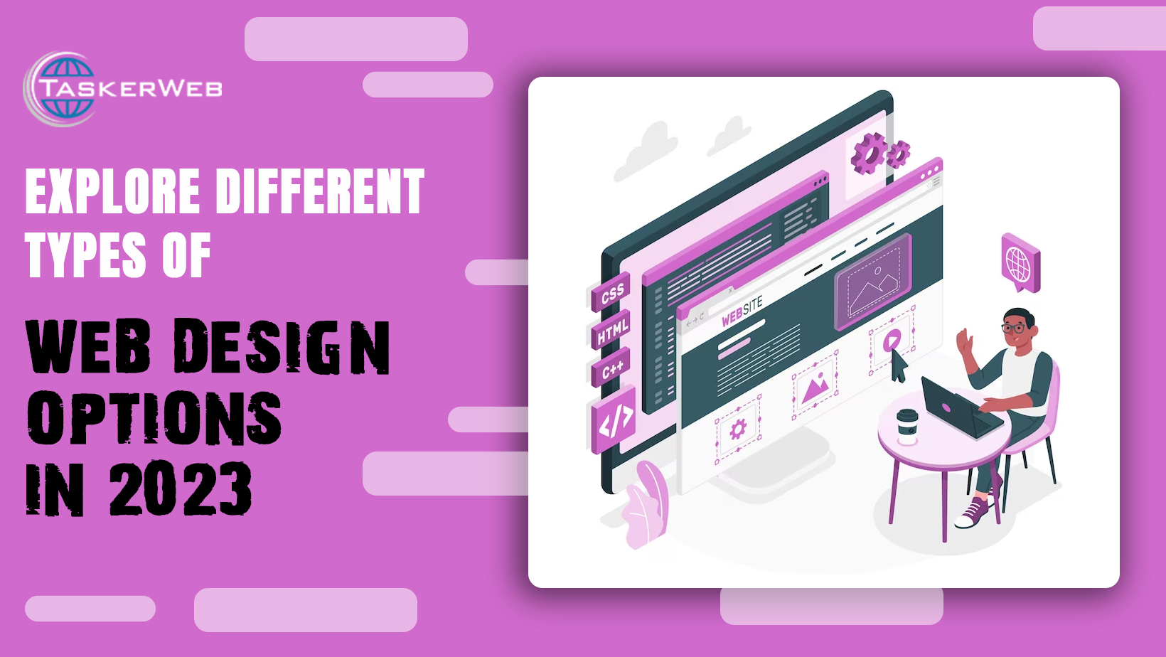
In 2023, Web design is a x-factor for the advertiser’s marketing strategy. It is crucial to design and assemble all the modern website options in such a way that it grabs your audience’s undivided attention. A web design should interest users to convert into customers with easy navigation options.
Now, many web design options fit the needs and demands of a business from dynamic industries and help create a distinguished environment in a competitive cyberspace.
Let us glance through the evolution of web design before diving into the latest web design options available today.
The Branching of Web Page Designs
Did you know? Tim Berners accidentally created the first web page that included HTML tags, headers, paragraphs, and links. Web pages were full of text at that time compared to today. These pages had a basic structure and did not consider special features, images, or videos. Internet connection was slow and the page loading speed was directly affected. Naturally, user experience was highly compromised.
In contrast, the present web page designs have evolved dramatically since 1991. Table-based layouts, quirky GIFs, vibrant colors, purposeful themes, and website counters have washed out the simple textual layouts.
As the technology advanced, the web page design began to branch out to accommodate all sorts of business demands. Each of the options has a unique style, approach, and purpose.
Let’s explore all the existing web page design options in 2023.
Types of Web Design Options
We will discuss X major web design options predominantly used in 2023.
1. Responsive Web Design
Responsive web design is a user-friendly page design option prepared for the user's choice of platform, screen size, and orientation.
Grid of dynamic layouts and images are flexibly grouped in this approach. Using the CSS media query helps you get there. The objective is to adjust all inputs to offer a seamless experience to users. For example, a layout should automatically readjust based on resolution scripts and image size for any website when the user switches a device to access your content.
A responsive design eliminates the need to create different designs to fit within unalike gadgets. In a responsive web design, the layout automatically switches between different versions without any manual interference.
2. Mobile-First Design
Mobile phones are the most used forerunners of the global digital revolution. The last decade recorded a 54 percent hike in mobile device users. This astounding growth called for new development methods and led to the creation of the mobile-first design.
Mobile-first design just like the name suggests, urges developers to begin creating a design first for mobile devices and the rest can follow later. The focus is dedicated to creating a sketch or prototype for the smallest device primarily and eventually advancing to big-screen gadgets.
This approach is significant for three reasons:
- Improved user access and experience
- Space limitation and sense of urgency to highlight paramount elements only
- Automatic inclination to design a smooth, attractive, and navigable page
3. Flat Design
Flat design is the web design style prioritizing simple two-dimensional elements along with bold and bright colors. This design is popular on Windows 8, Google, and Apple’s iOS 7.
This unique design type complements the responsive web designs where the design automatically scales with variations in screen sizes.
Flat design’s USP elements like minimalistic styles, bold colors, and smooth textures allow the responsive design to load faster across devices and platforms. Therefore, flat designs offer an optimal and streamlined user experience.
However, flat design has certain limitations that diminish the user experience. For example, the three-dimensional effect such as drop shadow enables marketers to highlight crucial aspects such as a “Buy Now” button. So, when a user views this button in the flat design, they do not think it is clickable as it does not look different from the other elements. As these issues and risks surfaced, there was an urgent need to make amends to the flat design.
Marketers are striking a perfect balance between flat design and eye-catching 3D elements. The product formed by merging the web design ideas is called “Flat Design 2.0” or “almost flat design”. This new approach has significantly improved the usability.
4. Material Design
Material Design is a distinctive design language created by Google to enhance users’ digital experience for iOS, Flutter, web, and Android.
This design was created by taking web design inspiration from physical world textures such as light reflections, shadows, and play of lights.
Material Design focuses exclusively on print design techniques such as typography, space, grids, color, space, and imagery. It focuses on bold graphics and intentional textures to add meaning, create hierarchy, and improve the user experience. Besides this, it is very interactive and allows users to take actions such as hover, press, or drag.
A Material Design allows you to create an innovative web design infused with visual elements such as cards, lists, or sheets.
The navigation is enhanced and simplified by special features such as tabs and navigation drawers.
Users can easily perform different tasks with the help of a floating action button.
Components such as chips, text fields, and selection control enable users to insert information or make selections.
You can notify your audience about the latest updates using dialog, snack bar, and banner components.
This design allows you to customize the theme to reflect the feel and look of your brand. You can fully alter the color typography to suit the mood and tone of your website.
5. Skeuomorphic Design
Skeuomorphic Designs are the ones that mimic real-life structures and qualities. The scope of skeuomorphic design extends beyond the textures, shadows and lights, dimensions, textures, etc.
Skeuomorphic design is inspired by skeuomorphism which was first observed in Ancient Greece. In the olden days, potters would make handles that looked exactly like metal handles.
With regards to the user interface, skeuomorphism came into existence with iPhones. Steve Jobs opined that when a design imitates or assumes a form just like real-life objects, its usability increases.
However, while you are thinking of incorporating skeuomorphs in your designs, you must be mindful of the following:
- Never go overboard with skeuomorph usage: When you put in a lot of objects within an interface, you unnecessarily clutter it. Focusing too much on realism can also lead to usability issues.
- Always serve some function: the idea behind introducing a skeuomorphic design is that it enables seamless user interaction. So find a function to represent it with skeuomorphism.
- Try not to complicate the interactions: Your goal should be to make things simple and easy for the visitors. Apply the design to complex and confusing interactions so the user experience is enhanced and navigation is simplified.
6. Minimalist Design
Minimalism has one simple motto – “Less is More”. It emphasizes balance, simplicity, contract, and alignment. In a minimalist web design, you will have predominant usage of large images, white spaces, and bold typography.
Let us look at a few characteristics of minimalism in the web design below:
- White Background: this background heavily contrasts against the bold and dark texts as well as other elements such as calls-to-action, images, etc.
- Bold Colors: The use of bold colors can grab all the attention direct it to the content and highlight the crucial elements. This tends to add meaning and emotion for the readers.
- Uncluttered Typography: Brilliant use of font and font size can enhance readability. Some fonts may appear fancy but are not easy to read. A smooth mix of appropriate font and font size can help your website stand out.
- Whitespace: It is also referred to as the negative space. It helps users understand what portions to focus on and what to neglect. Therefore, a user can easily navigate through the website. This attribute plays a significant role in driving a user to take an action.
7. Typography-Centric Design
Selecting the correct typeface that communicates with your audience and translates your business goals is crucial to out-of-the-box website designing. A typeface showcases your brand personality and helps manage users’ emotions.
Typograph web designers are professionals who dedicate their lives to creating flexible, legible, and neutral designs. Earlier when a typography was selected, the decision was based on traditional ideas regarding print design. However, in present times there are a lot of considerations to make in terms of font selection. These considerations are as follows:
- Screen Size: Responsive Design is excellent at adapting to even minor shifts in the dimension. Therefore, the typesetting functionality can be without a reason.
- Screen Resolution: There is a widespread use of high-resolution screens presently which ultimately increases the need to introduce pixel density within the typography.
- Screen Calibration: Different colors look different in various screen brightness. Therefore, a designer should incorporate a color and design that looks attractive in all screen settings.
8. Grid Layout Design
The grid layout refers to a digital practice of assembling, organizing, and aligning the website content on a page.
This grid pattern that you create reflects the basic structure of your website UI. This system plays a pivotal role in building an excellent user experience. The best web designer weighs all aspects of your business and creates a web grid to suit your business requirements. There are stages to cover in the website-building process. In these processes, various elements of a blog are accommodated within square or rectangular grids. Therefore, these grids are very important to the website’s overall structure.
Now, the web design elements can be of varying shapes and sizes but all are layered within the format of a grid. The best part about using this system is that it adds uniformity to all websites and enhances the usability and ease of navigation.
9. Parallax Scrolling Design
The Parallax Scrolling effect is the most engaging web design attribute you can incorporate into your website design. It adds depth, dimension, and movement to your website and brings it to life.
But what is Parallax Scrolling design and how does it work?
Parallax Scrolling design is a creative visual effect in which the background remains stationary while the foreground moves horizontally or vertically. In some websites, it is observed that both the background and the foreground move. However, their pace of movement differs. In this way, the visual effect creates an illusion of depth.
Let us look at a few valuable tips that could smoothen the process of Parallax Scrolling:
- Overdoing things will do more harm than good. Instead of adding the design to all web pages, select the page that will best suit the web design concepts as per your creative sensibility.
- Add the design on your homepage or in the headers and footers for maximum attention. You can hook your audience with the motion design and impart your content in plain simple texts.
- Compressing your images will take you a long way. Parallax scrolling design includes a wide range of CSS shapes and media files to add depth. Large files load slowly and thus hamper customer experience.
- Parallax scrolling is more than just movements, images, or figures, It is also about the proper use of colors. The contrast is played out by painting the background with desaturated, dull tones while the objects and elements and bright and bold. This further heightens the depth.
- As we discussed above, the parallax scrolling effect has different variations concerning the movement of the background and foreground. But the most frequently used design is the background moving slower than the foreground.
10. Illustrative Design
You must have heard about illustrations concerning paintings, sketches, and anime. But should you incorporate the essence illustrations in your website design?
Well, the answer is yes!
Illustrations can add a distinct and personal hue to your website. They create an attractive barrier between the text and other web design elements. Thus, it enhances the visual interest and also translates the brand’s inherent personality.
Customizing illustrations ensures that your website is unique and different from other similar-looking websites. You can use the custom illustrations to build a consistent brand image across different collaterals. The brand image you generate is unified, distinguished, and compelling.
There is no debate regarding the impact of visual media on memory. People tend to remember websites they have experienced in a visual format more than the ones in a textual format.
Popular websites that predominantly use illustrative web design are Slack, Mailchimp, and Dropbox.
11. Dark Mode Design
Bright, White screens have been normalized in webpages since always. Dark mode is also referred to as the black mode, night mode, or the spooky Lights-out mode. In this mode, the user has the freedom to decide whether they want white backgrounds or black backgrounds for themselves.
Popular websites such as Google Chrome, iOS, and Facebook introduced the dark mode which was followed by it being popularized everywhere.
But the question remains if you should consider a dark mode for your website.
Let us examine a few benefits of using a dark mode for your website:
- You respect your customers’ choices and allow them the option to navigate the way they prefer.
- Users are used to scrolling their mobile phones at night. The dark mode is more soothing to their eyes and they are more inclined to switch to it.
- The dark mode on the website suggests that it is updated and walks hand in hand with technological advancements.
- Several years of staring at white screens have encouraged users to try something new and different with the black screen option.
12. Single-Page Design
A single-page website, also called a one-page website comprises all the details of a web page on a single page. It does not have additional internal links to other pages such as ‘Home Page’, ‘Services’, ‘About Us’, etc.
A single-page website offers fluid navigation. The layout is clean, uncluttered, and loads faster. It is also easy to maintain this website. These web pages are made very attractive with modern textures and designs.
13. Interactive Web Design
Designing a website has the sole purpose of engaging the target audiences and urging them to take some action.
A website is a crucial lead-generation tool for brands. Usually, websites offer information or showcase the product. People are more likely to consume all the elements of your website if they actively interact with your website. This is how interactive web designs help you achieve your goals.
An interactive website facilitates this human and technology interaction in the most lively way. A few ways to make your website interactive are by including elements such as maps, animations, surveys, polls, games, etc. A great example of an interactive design is the spinning wheel tagged with coupons on rewards for customers on an e-commerce website. Users are usually thrilled to try the wheel of fortune.
14. Video Background Design
As the name suggests, in a video background design, the website layout is designed with a video as the background. It replaces the traditional static images that dominated the websites for decades. You can include different videos specially designed for individual sections or you may as well include a video demonstrating your product in use.
These designs have gained popularity in the past few years. It is incorporated on the website to make it more attractive for the audience and to drive conversions.
15. E-commerce Design
E-commerce design options play a pivotal role in e-commerce websites in grabbing a customer’s attention to the right spots. This design enables users to browse products, examine them, and make a purchasing decision.
E-commerce design utilizes certain fonts, colors, images, graphics, texts, and highlighting techniques to entice audiences into buying a product.
Key elements that are mandatory to build a successful e-commerce website are as follows:
- Easy to use.
- Be trustworthy.
- Create a compelling brand personality.
- It should subtly motivate people to buy from the website.
- Optimized to support conversions.
Wrapping Up
All the website designs that you come across have their benefits and drawbacks. It is for you to decide which design will serve your purpose in the best possible way. The distinct set of principles, best practices, and techniques will create a favorable environment for your business to flourish.
You must focus on your objectives such as fulfilling goals, engaging the target audience, and building an awesome brand identity, etc.
If you do not want to go with a single design option, you can explore the possibility of merging two different types of web design styles to build a unique web design for you.
Are you wondering how to design your website? Let us help you.
At Tasker Web, we house a team of proficient experts who specialize in website designing and applying digital marketing strategies that help you achieve your goals. Contact Us today and get a free consultation.


_.jpg)
